
Facebook 网络分析#
本 notebook 主要使用 NetworkX 库进行社交网络分析。具体来说,将对十个人的 Facebook 社交圈(好友列表)进行检查和详细分析,以提取各种有价值的信息。数据集可在此链接找到:Stanford Facebook Dataset。此外,众所周知,Facebook 网络是无向的且没有权重,因为用户只能与另一位用户成为一次朋友。从图分析的角度来看该数据集
每个节点代表一个匿名化的 Facebook 用户,该用户属于这十个好友列表中的一个。
每条边代表属于该网络的两位 Facebook 用户之间的好友关系。换句话说,两位用户必须在 Facebook 上成为好友,才能在该特定网络中连接起来。
注意:节点 \(0, 107, 348, 414, 686, 698, 1684, 1912, 3437, 3980\) 是将检查其好友列表的节点。这意味着它们是本次分析的焦点。这些节点被视为 焦点节点。
导入包#
import pandas as pd
import numpy as np
import networkx as nx
import matplotlib.pyplot as plt
from random import randint

%matplotlib inline
分析#
边从 data 文件夹加载并保存到 dataframe 中。每条边是一行,每条边有一个 start_node 和一个 end_node 列。
facebook = pd.read_csv(
    "data/facebook_combined.txt.gz",
    compression="gzip",
    sep=" ",
    names=["start_node", "end_node"],
)
facebook
| start_node | end_node | |
|---|---|---|
| 0 | 0 | 1 |
| 1 | 0 | 2 |
| 2 | 0 | 3 |
| 3 | 0 | 4 |
| 4 | 0 | 5 |
| ... | ... | ... |
| 88229 | 4026 | 4030 |
| 88230 | 4027 | 4031 |
| 88231 | 4027 | 4032 |
| 88232 | 4027 | 4038 |
| 88233 | 4031 | 4038 |
88234 行 × 2 列
图由边的 facebook dataframe 创建。
G = nx.from_pandas_edgelist(facebook, "start_node", "end_node")
可视化图#
让我们通过可视化图来开始探索。可视化在探索性数据分析中起着核心作用,有助于获得对数据的定性感觉。
由于我们对数据结构没有实际概念,让我们先使用 random_layout 查看图,它是布局函数中最快的一种。
fig, ax = plt.subplots(figsize=(15, 9))
ax.axis("off")
plot_options = {"node_size": 10, "with_labels": False, "width": 0.15}
nx.draw_networkx(G, pos=nx.random_layout(G), ax=ax, **plot_options)
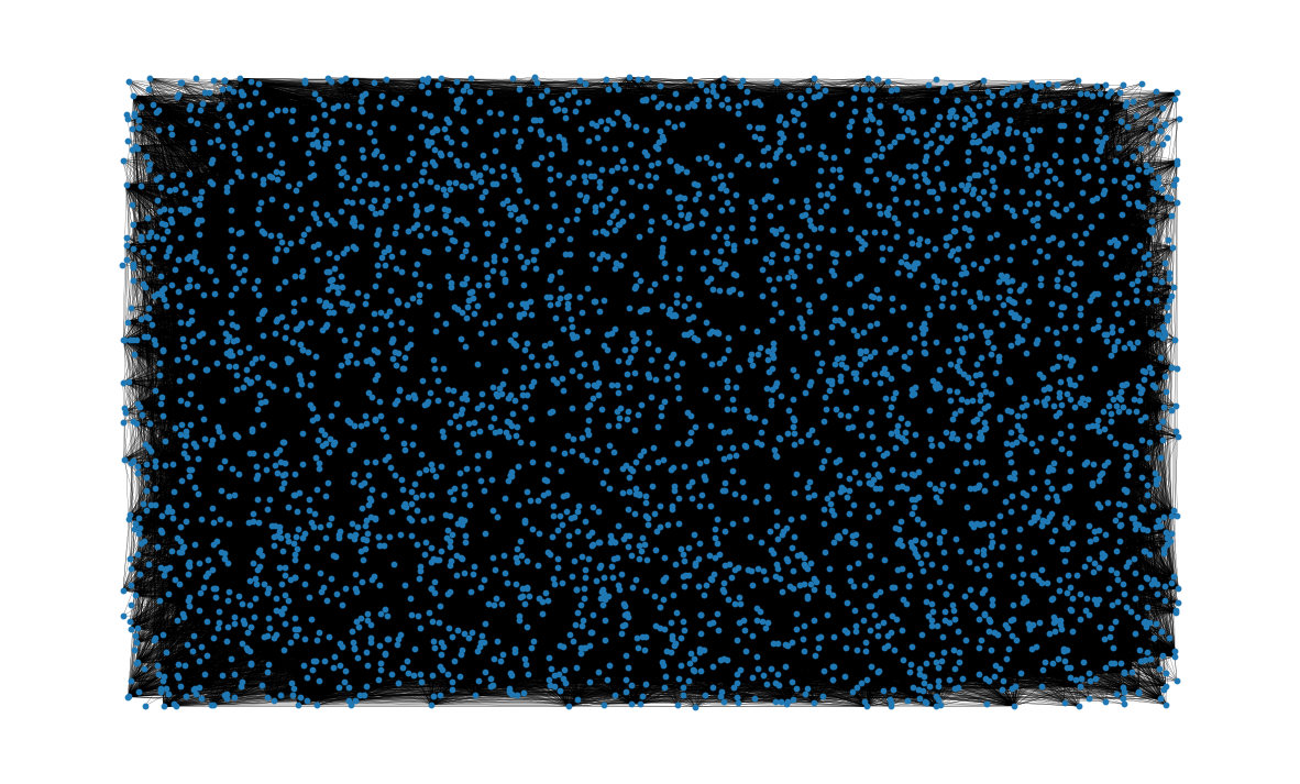
结果图像…不太有用。由于边重叠导致缠绕混乱,这类图可视化有时被戏称为“毛球”。
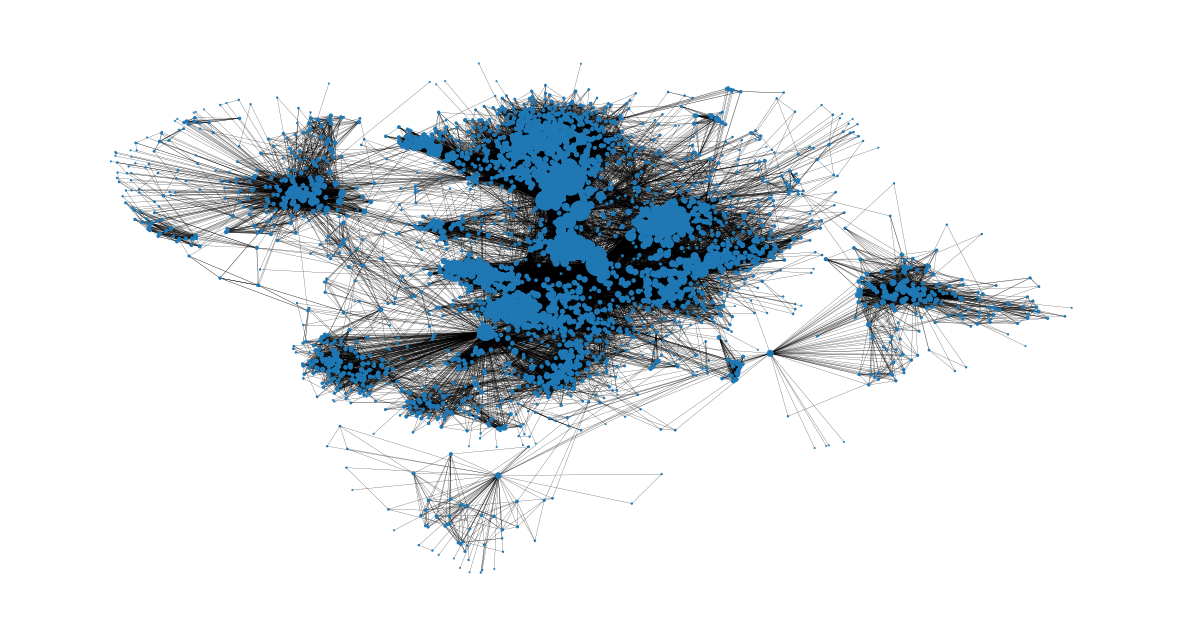
很明显,如果我们想了解数据,我们需要对节点位置施加更多结构。为此,我们可以使用 spring_layout 函数,它是 networkx 绘图模块的默认布局函数。 spring_layout 函数的优点在于它考虑节点和边来计算节点位置。然而缺点是,这个过程计算成本高得多,对于包含数百个节点和数千条边的图来说可能相当慢。
由于我们的数据集有超过 8 万条边,我们将限制 spring_layout 函数中使用的迭代次数,以减少计算时间。我们还将保存计算出的布局,以便将来用于可视化。
pos = nx.spring_layout(G, iterations=15, seed=1721)
fig, ax = plt.subplots(figsize=(15, 9))
ax.axis("off")
nx.draw_networkx(G, pos=pos, ax=ax, **plot_options)
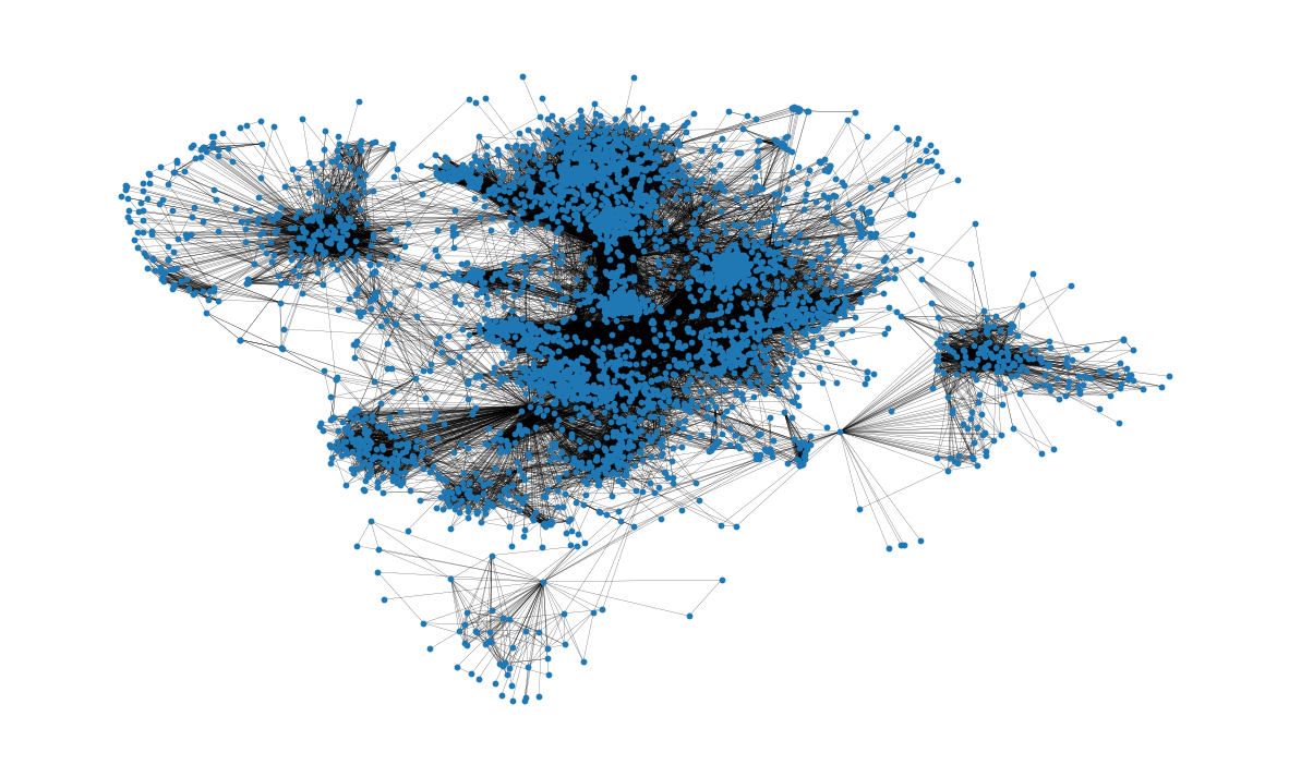
这个可视化比之前的有用多了!我们已经可以从中了解到网络结构的一些信息;例如,许多节点似乎高度连接,这对于社交网络来说是可以预料的。我们也感觉到节点倾向于形成簇。 spring_layout 用于提供聚类的定性感觉,但并非为可重复的、定性聚类分析而设计。我们将在后面的分析中再次讨论网络聚类的评估。
基本拓扑属性#
网络中的节点总数
G.number_of_nodes()
4039
边总数
G.number_of_edges()
88234
此外,还可以看到节点的平均度。
平均而言,一个节点连接到近 44 个其他节点,也称为节点的邻居。
这是通过创建一个包含所有节点度的列表,并使用
numpy.array找到所创建列表的平均值来计算的。
np.mean([d for _, d in G.degree()])
np.float64(43.69101262688784)
图中的路径分布有许多有趣的属性。例如,图的直径表示连接图中任意两个节点的最短路径中最长的那一条。类似地,平均路径长度衡量了从网络中的一个节点到达另一个节点需要遍历的平均边数。这些属性可以分别使用 nx.diameter 和 nx.average_shortest_path_length 函数计算。但是请注意,这些分析需要计算网络中每一对节点之间的最短路径:对于这种规模的网络来说,这可能非常耗时!由于我们对涉及网络中所有节点最短路径长度的几项分析感兴趣,我们可以计算一次并重用信息以节省计算时间。
让我们首先计算网络中所有节点对之间的最短路径长度。
shortest_path_lengths = dict(nx.all_pairs_shortest_path_length(G))
nx.all_pairs_shortest_path_length 返回一个字典的字典,它将节点 u 映射到网络中的所有其他节点,其中最内层的映射返回两个节点之间的最短路径长度。换句话说,shortest_path_lengths[u][v] 将返回任意两个节点 u 和 v 之间的最短路径长度。
shortest_path_lengths[0][42] # Length of shortest path between nodes 0 and 42
1
现在让我们使用 shortest_path_lengths 来执行我们的分析,从图 G 的直径开始。如果我们仔细查看 nx.diameter 的文档字符串,我们会看到它等价于图的最大离心率。结果表明,nx.eccentricity 有一个可选参数 sp,我们可以传入我们预先计算好的 shortest_path_lengths 来节省额外的计算。
# This is equivalent to `diameter = nx.diameter(G), but much more efficient since we're
# reusing the pre-computed shortest path lengths!
diameter = max(nx.eccentricity(G, sp=shortest_path_lengths).values())
diameter
8
为了从一个节点连接到任何其他节点,我们需要遍历 8 条边或更少。
接下来,找到平均路径长度。同样,我们可以直接使用 nx.average_shortest_path_length 来计算,但使用我们已经计算好的 shortest_path_length 会效率得多。
# Compute the average shortest path length for each node
average_path_lengths = [
    np.mean(list(spl.values())) for spl in shortest_path_lengths.values()
]
# The average over all nodes
np.mean(average_path_lengths)
np.float64(3.691592636562027)
这表示所有节点对的最短路径长度的平均值:为了从一个节点到达另一个节点,平均大约需要遍历 3.6 条边。
上述度量捕获了关于网络的有用信息,但像平均值这样的度量仅代表分布的一个方面;查看分布本身也通常很有价值。同样,我们可以从我们预先计算的字典的字典中构建最短路径长度分布的可视化。
# We know the maximum shortest path length (the diameter), so create an array
# to store values from 0 up to (and including) diameter
path_lengths = np.zeros(diameter + 1, dtype=int)

# Extract the frequency of shortest path lengths between two nodes
for pls in shortest_path_lengths.values():
    pl, cnts = np.unique(list(pls.values()), return_counts=True)
    path_lengths[pl] += cnts

# Express frequency distribution as a percentage (ignoring path lengths of 0)
freq_percent = 100 * path_lengths[1:] / path_lengths[1:].sum()

# Plot the frequency distribution (ignoring path lengths of 0) as a percentage
fig, ax = plt.subplots(figsize=(15, 8))
ax.bar(np.arange(1, diameter + 1), height=freq_percent)
ax.set_title(
    "Distribution of shortest path length in G", fontdict={"size": 35}, loc="center"
)
ax.set_xlabel("Shortest Path Length", fontdict={"size": 22})
ax.set_ylabel("Frequency (%)", fontdict={"size": 22})
Text(0, 0.5, 'Frequency (%)')
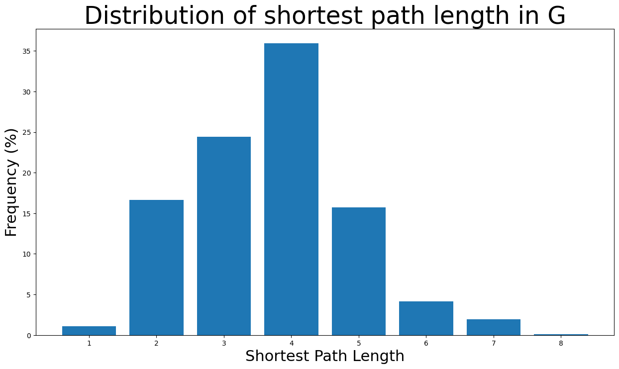
绝大多数最短路径长度在 \(2\) 到 \(5\) 条边之间。此外,节点对的最短路径长度为 8(直径长度)的可能性极低,因为可能性小于 \(0.1\)%。
这里计算图的密度。显然,图是一个非常稀疏的图,因为:\(density < 1\)
nx.density(G)
0.010819963503439287
下面找到了图的组件数量。正如预期,该网络由一个巨大的连通分量组成。
nx.number_connected_components(G)
1
中心性度量#
现在将检查 Facebook 图的中心性度量。
度中心性#
度中心性简单地根据每个节点持有的链接数量来分配重要性得分。在本次分析中,这意味着节点的度中心性越高,连接到该特定节点的边越多,因此该节点拥有的邻居节点(Facebook 好友)也越多。事实上,节点的度中心性是其连接的节点所占的比例。换句话说,它是该特定节点所连接的网络百分比,即与其成为好友的百分比。
首先,我们找出度中心性最高的节点。具体来说,下面显示了度中心性最高的 8 个节点及其度中心性值。
degree_centrality = nx.centrality.degree_centrality(
    G
)  # save results in a variable to use again
(sorted(degree_centrality.items(), key=lambda item: item[1], reverse=True))[:8]
[(107, 0.258791480931154),
 (1684, 0.1961367013372957),
 (1912, 0.18697374938088163),
 (3437, 0.13546310054482416),
 (0, 0.08593363051015354),
 (2543, 0.07280832095096582),
 (2347, 0.07206537890044576),
 (1888, 0.0629024269440317)]
这意味着节点 \(107\) 具有最高的度中心性,为 \(0.259\),表示这位 Facebook 用户是整个网络中约 26% 的人的好友。类似地,节点 \(1684, 1912, 3437\) 和 \(0\) 也具有非常高的度中心性。然而,这是意料之中的,因为这些节点是我们正在检查其 Facebook 社交圈的节点。非常有趣的是,节点 \(2543, 2347, 1888\) 即使我们没有调查它们的社交圈,也具有最高的 8 个度中心性中的一些。换句话说,这三个节点在我们现在检查的社交圈中非常受欢迎,这意味着除了焦点节点之外,它们在该网络中拥有最多的 Facebook 好友。
现在我们还可以看到度中心性最高节点的邻居数量。
(sorted(G.degree, key=lambda item: item[1], reverse=True))[:8]
[(107, 1045),
 (1684, 792),
 (1912, 755),
 (3437, 547),
 (0, 347),
 (2543, 294),
 (2347, 291),
 (1888, 254)]
正如预期的那样,节点 \(107\) 拥有 \(1045\) 个 Facebook 好友,这是本次分析中任何 Facebook 用户拥有的最多好友数。此外,节点 \(1684\) 和 \(1912\) 在该网络中拥有超过 \(750\) 个 Facebook 好友。节点 \(3437\) 和 \(0\) 在该网络中拥有的 Facebook 好友数次之,分别为 \(547\) 和 \(347\)。最后,焦点节点的两个最受欢迎的好友在该网络中拥有约 \(290\) 个 Facebook 好友。
现在将绘制度中心性的分布图。
plt.figure(figsize=(15, 8))
plt.hist(degree_centrality.values(), bins=25)
plt.xticks(ticks=[0, 0.025, 0.05, 0.1, 0.15, 0.2])  # set the x axis ticks
plt.title("Degree Centrality Histogram ", fontdict={"size": 35}, loc="center")
plt.xlabel("Degree Centrality", fontdict={"size": 20})
plt.ylabel("Counts", fontdict={"size": 20})
Text(0, 0.5, 'Counts')
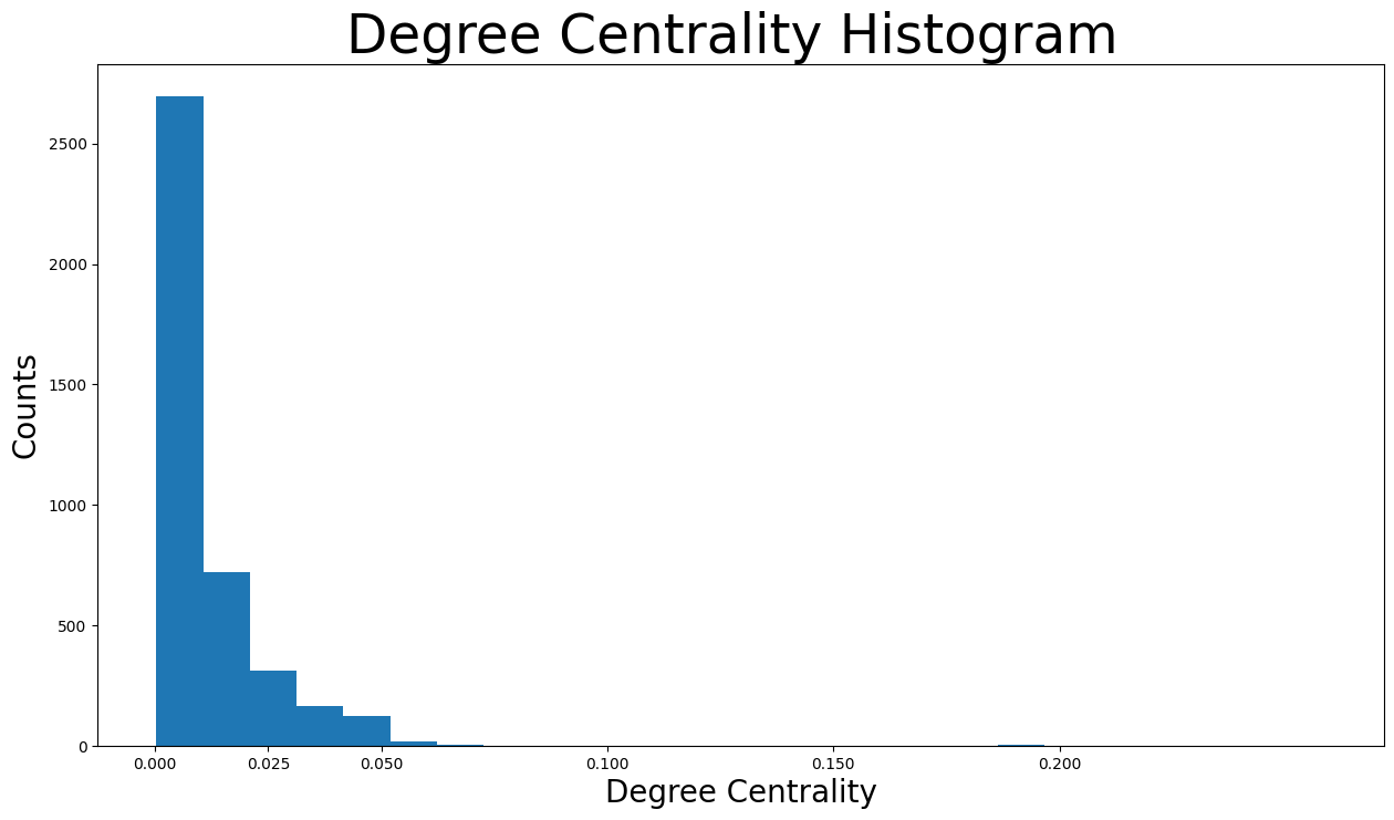
可以看出,绝大多数 Facebook 用户的度中心性小于 \(0.05\)。实际上,大多数小于 \(0.0125\)。这实际上是合理的,因为该网络由特定节点的好友列表组成,这些节点显然是度中心性最高的节点。换句话说,由于仅使用特定节点的好友列表创建了该特定网络,许多节点的度中心性极低,因为它们在该网络中不是非常互联。
现在让我们从节点大小的角度查看度中心性最高的用户。
node_size = [
    v * 1000 for v in degree_centrality.values()
]  # set up nodes size for a nice graph representation
plt.figure(figsize=(15, 8))
nx.draw_networkx(G, pos=pos, node_size=node_size, with_labels=False, width=0.15)
plt.axis("off")
(np.float64(-0.9991946166753769),
 np.float64(1.1078343337774277),
 np.float64(-1.1645995157957079),
 np.float64(0.7322139519453049))
介数中心性#
介数中心性衡量一个节点位于其他节点之间最短路径上的次数,这意味着它充当桥梁。具体来说,节点 \(v\) 的介数中心性是任何两个节点(不包括 \(v\))的所有最短路径中经过 \(v\) 的路径所占的百分比。特别地,在 Facebook 图中,此度量与用户影响他人的能力相关。介数中心性高的用户充当了许多非好友用户之间的桥梁,因此可以通过传递信息(例如,发布或分享帖子)来影响他们,甚至通过用户的社交圈将他们连接起来(这之后会降低用户的介数中心性)。
现在,将计算介数中心性最高的 \(8\) 个节点,并显示其中心性值。
betweenness_centrality = nx.centrality.betweenness_centrality(
    G
)  # save results in a variable to use again
(sorted(betweenness_centrality.items(), key=lambda item: item[1], reverse=True))[:8]
[(107, 0.4805180785560152),
 (1684, 0.3377974497301992),
 (3437, 0.23611535735892905),
 (1912, 0.2292953395868782),
 (1085, 0.14901509211665306),
 (0, 0.14630592147442917),
 (698, 0.11533045020560802),
 (567, 0.09631033121856215)]
查看结果,节点 \(107\) 的介数中心性为 \(0.48\),表示它位于其他节点之间总最短路径的近一半上。此外,结合度中心性的知识
节点 \(0, 107, 1684, 1912, 3437\) 同时具有最高的度和介数中心性,并且是
焦点节点。这表明这些节点既是网络中最受欢迎的节点,也能够影响和传播信息。然而,这些节点是其好友列表构成网络的节点之一,因此这是一个预期的发现。节点 \(567, 1085\) 不是焦点节点,它们具有最高的介数中心性中的一些,但没有最高的度中心性。这意味着即使这些节点不是网络中最受欢迎的用户,当涉及信息传播时,它们在焦点节点的朋友中具有最大的影响力。
节点 \(698\) 是一个
焦点节点,它具有很高的介数中心性,尽管它没有最高的度中心性。换句话说,这个节点在 Facebook 上没有非常大的好友列表。然而,用户的整个好友列表是网络的一部分,因此用户可以通过充当中介连接网络中的不同社交圈。
接下来,将绘制介数中心性的分布图。
plt.figure(figsize=(15, 8))
plt.hist(betweenness_centrality.values(), bins=100)
plt.xticks(ticks=[0, 0.02, 0.1, 0.2, 0.3, 0.4, 0.5])  # set the x axis ticks
plt.title("Betweenness Centrality Histogram ", fontdict={"size": 35}, loc="center")
plt.xlabel("Betweenness Centrality", fontdict={"size": 20})
plt.ylabel("Counts", fontdict={"size": 20})
Text(0, 0.5, 'Counts')
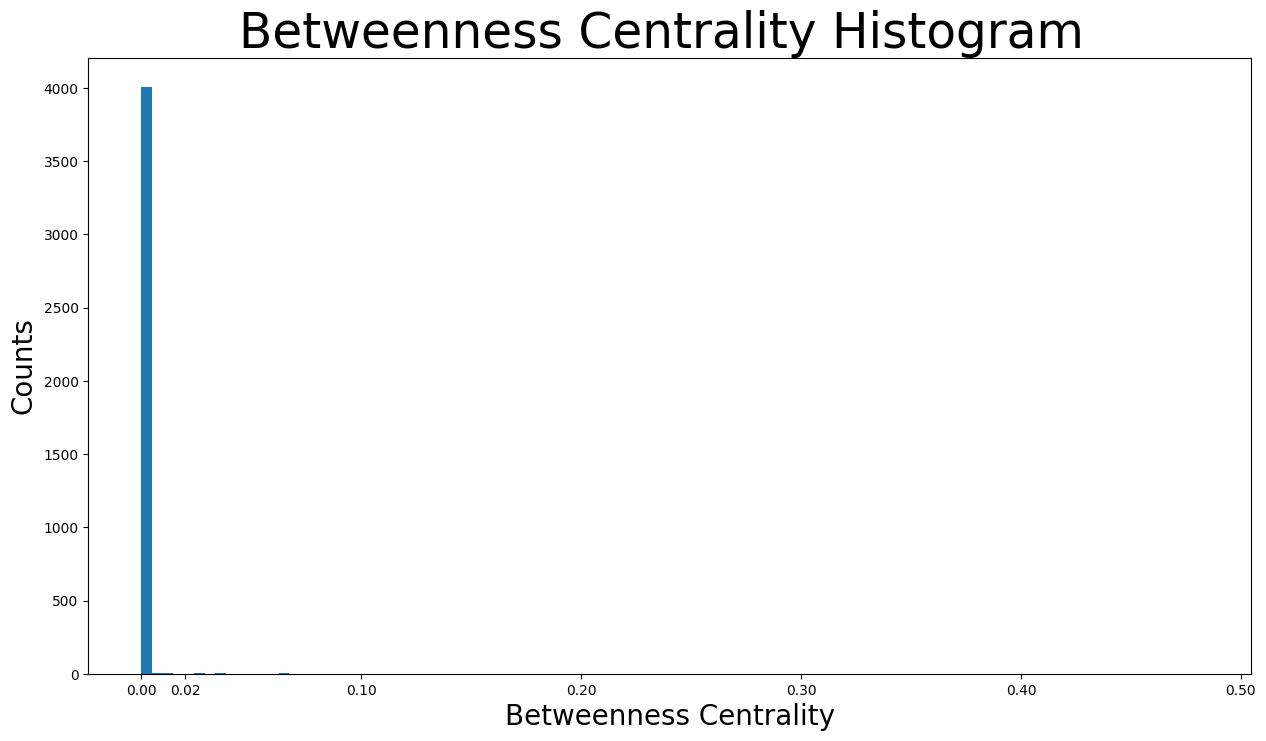
正如我们所见,绝大多数介数中心性低于 \(0.01\)。这是合理的,因为图非常稀疏,因此大多数节点在最短路径中不充当桥梁。然而,这也导致一些节点的介数中心性极高,例如节点 \(107\) 的介数中心性为 \(0.48\),节点 \(1684\) 的介数中心性为 \(0.34\)。
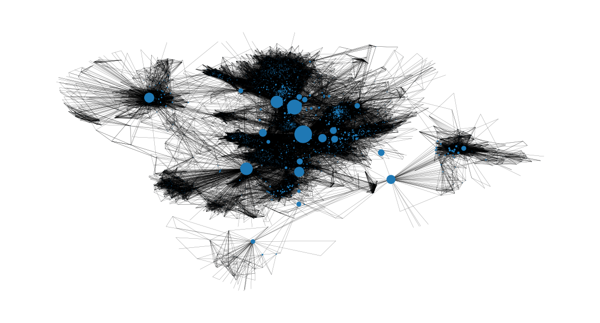
我们还可以获得介数中心性最高节点及其在网络中位置的图像。很明显,它们是从一个社区到另一个社区的桥梁。
node_size = [
    v * 1200 for v in betweenness_centrality.values()
]  # set up nodes size for a nice graph representation
plt.figure(figsize=(15, 8))
nx.draw_networkx(G, pos=pos, node_size=node_size, with_labels=False, width=0.15)
plt.axis("off")
(np.float64(-0.9991946166753769),
 np.float64(1.1078343337774277),
 np.float64(-1.1645995157957079),
 np.float64(0.7322139519453049))
接近中心性#
接近中心性根据每个节点与网络中所有其他节点的“接近程度”对其进行评分。对于节点 \(v\),其接近中心性衡量了它到所有其他节点的平均距离的倒数。换句话说,\(v\) 的接近中心性越高,它距离网络中心越近。
接近中心性度量对于监控虚假信息(例如假新闻)或病毒(例如在本例中获取 Facebook 账户控制权的恶意链接)的传播非常重要。让我们以假新闻为例。如果具有最高接近中心性度量的用户开始传播一些虚假信息(分享或创建帖子),整个网络将最快地被误导。然而,如果一个接近中心性非常低的用户尝试这样做,误导信息向整个网络的传播将慢得多。这是因为虚假信息必须首先到达具有高接近中心性的用户,由其传播到网络中的许多不同部分。
现在将找出接近中心性最高的节点。
closeness_centrality = nx.centrality.closeness_centrality(
    G
)  # save results in a variable to use again
(sorted(closeness_centrality.items(), key=lambda item: item[1], reverse=True))[:8]
[(107, 0.45969945355191255),
 (58, 0.3974018305284913),
 (428, 0.3948371956585509),
 (563, 0.3939127889961955),
 (1684, 0.39360561458231796),
 (171, 0.37049270575282134),
 (348, 0.36991572004397216),
 (483, 0.3698479575013739)]
检查接近中心性最高的用户,我们发现与之前的指标相比,他们之间没有巨大的差距。此外,节点 \(107, 1684, 348\) 是在接近中心性最高的节点中找到的仅有的 焦点节点。这意味着拥有许多好友的节点不一定靠近网络中心。
此外,节点 \(v\) 到任何其他节点的平均距离可以使用以下公式轻松找到
1 / closeness_centrality[107]
2.1753343239227343
从节点 \(107\) 到随机节点的距离大约是两跳。
此外,接近中心性的分布图
plt.figure(figsize=(15, 8))
plt.hist(closeness_centrality.values(), bins=60)
plt.title("Closeness Centrality Histogram ", fontdict={"size": 35}, loc="center")
plt.xlabel("Closeness Centrality", fontdict={"size": 20})
plt.ylabel("Counts", fontdict={"size": 20})
Text(0, 0.5, 'Counts')
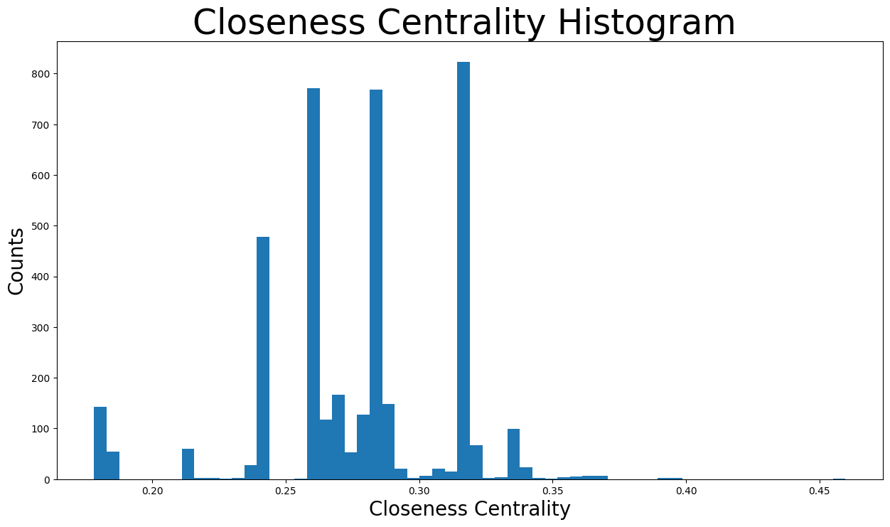
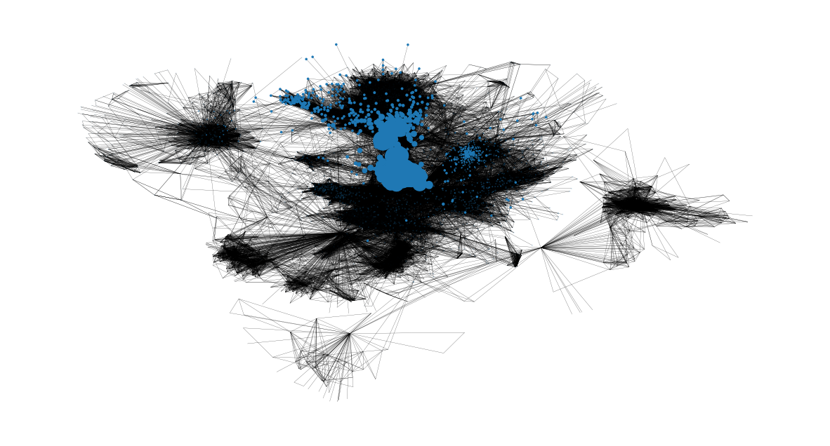
接近中心性分布在 \(0.17\) 到 \(0.46\) 之间的各种值。事实上,大多数位于 \(0.25\) 和 \(0.3\) 之间。这意味着大多数节点相对靠近网络中心,因此总体而言与其他节点也很近。然而,也有一些社区位于更远处,其节点将具有最低的接近中心性,如下所示。
node_size = [
    v * 50 for v in closeness_centrality.values()
]  # set up nodes size for a nice graph representation
plt.figure(figsize=(15, 8))
nx.draw_networkx(G, pos=pos, node_size=node_size, with_labels=False, width=0.15)
plt.axis("off")
(np.float64(-0.9991946166753769),
 np.float64(1.1078343337774277),
 np.float64(-1.1645995157957079),
 np.float64(0.7322139519453049))
特征向量中心性#
特征向量中心性是衡量一个节点与网络中其他重要节点连接程度的指标。它基于节点在网络内的连接程度、其连接有多少链接等来衡量节点的影响力。这个度量可以识别对整个网络最具影响力的节点。高的特征向量中心性意味着该节点连接到其他本身具有高特征向量中心性的节点。在本次 Facebook 分析中,该度量与用户影响整个图的能力相关,因此特征向量中心性最高的用户是该网络中最重要的节点。
现在将检查特征向量中心性最高的节点。
eigenvector_centrality = nx.centrality.eigenvector_centrality(
    G
)  # save results in a variable to use again
(sorted(eigenvector_centrality.items(), key=lambda item: item[1], reverse=True))[:10]
[(1912, 0.09540696149067629),
 (2266, 0.08698327767886552),
 (2206, 0.08605239270584342),
 (2233, 0.08517340912756598),
 (2464, 0.08427877475676092),
 (2142, 0.08419311897991795),
 (2218, 0.0841557356805503),
 (2078, 0.08413617041724977),
 (2123, 0.08367141238206224),
 (1993, 0.0835324284081597)]
检查结果
节点 \(1912\) 具有最高的特征向量中心性,为 \(0.095\)。该节点也是一个
焦点节点,从对整个网络的总体影响力来看,无疑可以被认为是网络中最重要的节点。事实上,该节点也具有最高的度中心性和介数中心性中的一些,使得该用户非常受欢迎并对其他节点具有影响力。节点 \(1993, 2078, 2206, 2123, 2142, 2218, 2233, 2266, 2464\),尽管它们不是焦点节点,但也具有最高的特征向量中心性中的一些,大约在 \(0.83-0.87\) 之间。非常有趣的是,所有这些节点都是第一次被识别出来,这意味着它们在该图中既没有最高的度中心性、介数中心性,也没有接近中心性。这导致得出结论,这些节点很可能与节点 \(1912\) 连接,因此具有非常高的特征向量中心性。
检查这些节点是否连接到最重要的节点 \(1912\),假设是正确的。
high_eigenvector_centralities = (
    sorted(eigenvector_centrality.items(), key=lambda item: item[1], reverse=True)
)[
    1:10
]  # 2nd to 10th nodes with heighest eigenvector centralities
high_eigenvector_nodes = [
    tuple[0] for tuple in high_eigenvector_centralities
]  # set list as [2266, 2206, 2233, 2464, 2142, 2218, 2078, 2123, 1993]
neighbors_1912 = [n for n in G.neighbors(1912)]  # list with all nodes connected to 1912
all(
    item in neighbors_1912 for item in high_eigenvector_nodes
)  # check if items in list high_eigenvector_nodes exist in list neighbors_1912
True
让我们检查特征向量中心性的分布图。
plt.figure(figsize=(15, 8))
plt.hist(eigenvector_centrality.values(), bins=60)
plt.xticks(ticks=[0, 0.01, 0.02, 0.04, 0.06, 0.08])  # set the x axis ticks
plt.title("Eigenvector Centrality Histogram ", fontdict={"size": 35}, loc="center")
plt.xlabel("Eigenvector Centrality", fontdict={"size": 20})
plt.ylabel("Counts", fontdict={"size": 20})
Text(0, 0.5, 'Counts')
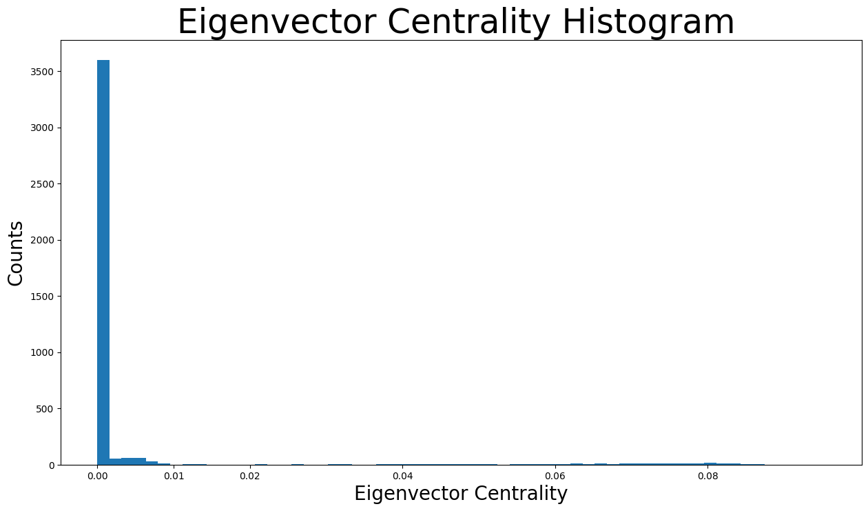
如分布直方图所示,绝大多数特征向量中心性低于 \(0.005\),实际上几乎为 \(0\)。然而,由于 x 轴上分布着许多微小的条形,我们也可以看到不同的特征向量中心性值。
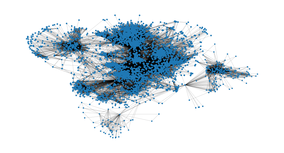
现在我们可以根据以下表示中节点的大小来识别节点的特征向量中心性。
node_size = [
    v * 4000 for v in eigenvector_centrality.values()
]  # set up nodes size for a nice graph representation
plt.figure(figsize=(15, 8))
nx.draw_networkx(G, pos=pos, node_size=node_size, with_labels=False, width=0.15)
plt.axis("off")
(np.float64(-0.9991946166753769),
 np.float64(1.1078343337774277),
 np.float64(-1.1645995157957079),
 np.float64(0.7322139519453049))
聚类效应#
节点 \(v\) 的聚类系数定义为从 \(v\) 的朋友中随机选择的两个朋友之间也互为朋友的概率。因此,平均聚类系数是所有节点聚类系数的平均值。平均聚类系数越接近 \(1\),图就越完整,因为它只有一个巨大的连通分量。最后,它是三元闭合的标志,因为图越完整,通常会出现的三角形就越多。
nx.average_clustering(G)
0.6055467186200862
现在将显示聚类系数分布图。
plt.figure(figsize=(15, 8))
plt.hist(nx.clustering(G).values(), bins=50)
plt.title("Clustering Coefficient Histogram ", fontdict={"size": 35}, loc="center")
plt.xlabel("Clustering Coefficient", fontdict={"size": 20})
plt.ylabel("Counts", fontdict={"size": 20})
Text(0, 0.5, 'Counts')
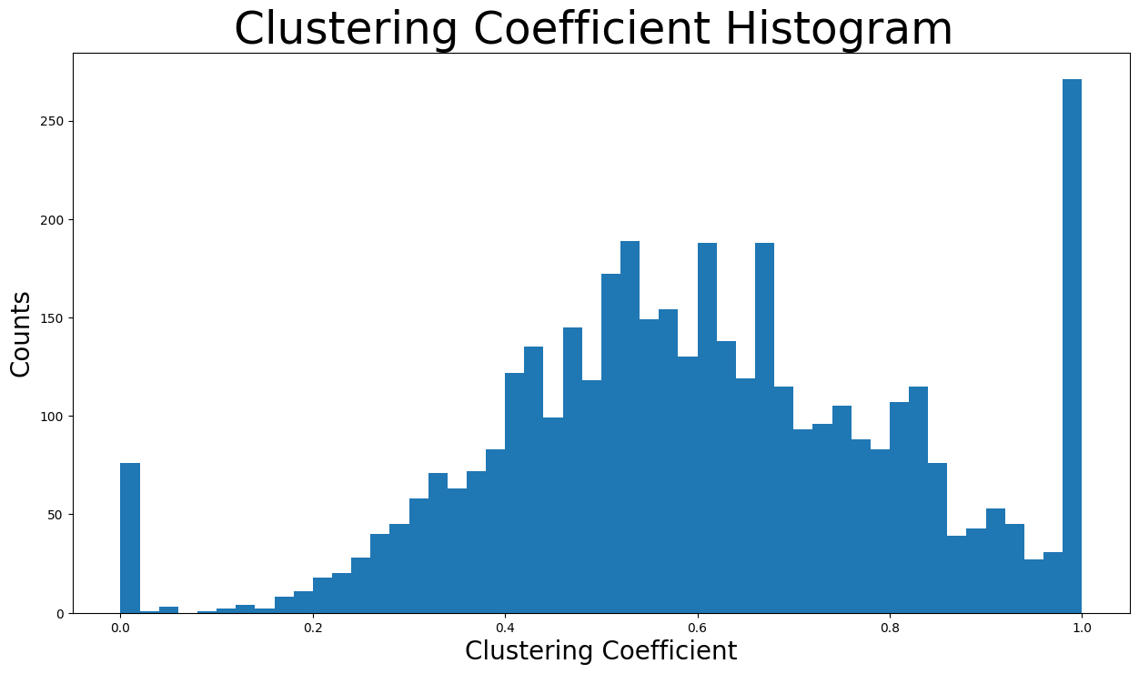
使用 \(50\) 个 bin 来展示分布。计数最高的 bin 涉及聚类系数接近 \(1\) 的节点,因为该 bin 中有超过两百五十个节点。此外,聚类系数在 \(0.4\) 到 \(0.8\) 之间的 bin 包含绝大多数节点。
接下来找到网络中唯一三角形的数量。
triangles_per_node = list(nx.triangles(G).values())
sum(
    triangles_per_node
) / 3  # divide by 3 because each triangle is counted once for each node
1612010.0
现在是一个节点所属三角形的平均数量。
np.mean(triangles_per_node)
np.float64(1197.3334983906907)
由于有些节点属于非常多的三角形,中位数这一度量将使我们更好地理解情况。
np.median(triangles_per_node)
np.float64(161.0)
事实上,中位数值仅为 \(161\) 个三角形,而平均值约为 \(1197\) 个节点所属的三角形。这意味着网络中的大多数节点仅属于极少数三角形,而一些节点则属于大量的三角形(这些是增加平均值的极端值)。
总之,高平均聚类系数以及大量的三角形是三元闭合的迹象。具体来说,三元闭合意味着随着时间的推移,新边倾向于在拥有一个或多个共同好友的两个用户之间形成。这可以通过 Facebook 通常在用户和新朋友之间有许多共同好友时向用户推荐新朋友来解释。此外,还存在潜在的压力来源。例如,如果节点 \(A\) 是节点 \(B\) 和 \(C\) 的好友,则如果 \(B\) 和 \(C\) 不是好友,就会产生一些紧张关系。
桥#
首先,图中的一条连接节点 A 和 B 的边如果删除该边会导致 A 和 B 位于两个不同的连通分量中,则该边被认为是桥。现在检查此网络中是否存在桥。
nx.has_bridges(G)
True
实际上,网络中存在桥。现在将作为桥的边保存在一个列表中,并打印它们的数量。
bridges = list(nx.bridges(G))
len(bridges)
75
存在如此多的桥梁,是因为该网络仅包含焦点节点及其好友。因此,一些焦点节点的好友仅连接到一个焦点节点,使得该边成为桥梁。
此外,将作为局部桥的边保存在一个列表中,并打印它们的数量。具体来说,图中的一条连接节点 \(C\) 和 \(D\) 的边是局部桥,如果其端点 \(C\) 和 \(D\) 没有共同的好友。非常重要的是,作为桥的边也是局部桥。因此,此列表也包含所有上述桥。
local_bridges = list(nx.local_bridges(G, with_span=False))
len(local_bridges)
78
现在展示网络中的桥和局部桥。桥用红色显示,局部桥用绿色显示。黑色边既不是局部桥也不是桥。
很明显,所有桥都涉及仅连接到焦点节点(度为 \(1\))的节点。
plt.figure(figsize=(15, 8))
nx.draw_networkx(G, pos=pos, node_size=10, with_labels=False, width=0.15)
nx.draw_networkx_edges(
    G, pos, edgelist=local_bridges, width=0.5, edge_color="lawngreen"
)  # green color for local bridges
nx.draw_networkx_edges(
    G, pos, edgelist=bridges, width=0.5, edge_color="r"
)  # red color for bridges
plt.axis("off")
(np.float64(-0.9991946166753769),
 np.float64(1.1078343337774277),
 np.float64(-1.1645995157957079),
 np.float64(0.7322139519453049))

同配性#
同配性描述了网络节点倾向于连接某种程度上相似的其他节点的偏好。
以节点度为基础的同配性通过两种方式找到。
nx.degree_assortativity_coefficient(G)
0.06357722918564943
nx.degree_pearson_correlation_coefficient(
    G
)  # use the potentially faster scipy.stats.pearsonr function.
0.06357722918564918
实际上,同配性系数是连接节点对之间度的皮尔逊相关系数。这意味着它的取值范围从 \(-1\) 到 \(1\)。具体来说,正的同配性系数表示度相似的节点之间存在相关性,而负的则表示度不同的节点之间存在相关性。
在我们的例子中,同配性系数约为 \(0.064\),接近于 0。这意味着该网络几乎是非同配性的,我们不能根据节点的度来关联连接的节点。换句话说,我们不能从用户朋友的朋友数量(朋友的度)来推断用户的交友数量。这是有道理的,因为我们只使用了焦点节点的好友列表,非焦点节点往往朋友数量要少得多。
网络社区#
社区是一组节点,组内的节点之间连接的边远多于组之间的边。该网络将使用两种不同的算法进行社区检测。
首先,使用半同步标签传播方法[1]来检测社区。
该函数自行确定将要检测的社区数量。现在将遍历社区,并创建一个颜色列表,为属于同一社区的节点包含相同的颜色。此外,还会打印社区的数量。
colors = ["" for x in range(G.number_of_nodes())]  # initialize colors list
counter = 0
for com in nx.community.label_propagation_communities(G):
    color = "#%06X" % randint(0, 0xFFFFFF)  # creates random RGB color
    counter += 1
    for node in list(
        com
    ):  # fill colors list with the particular color for the community nodes
        colors[node] = color
counter
44
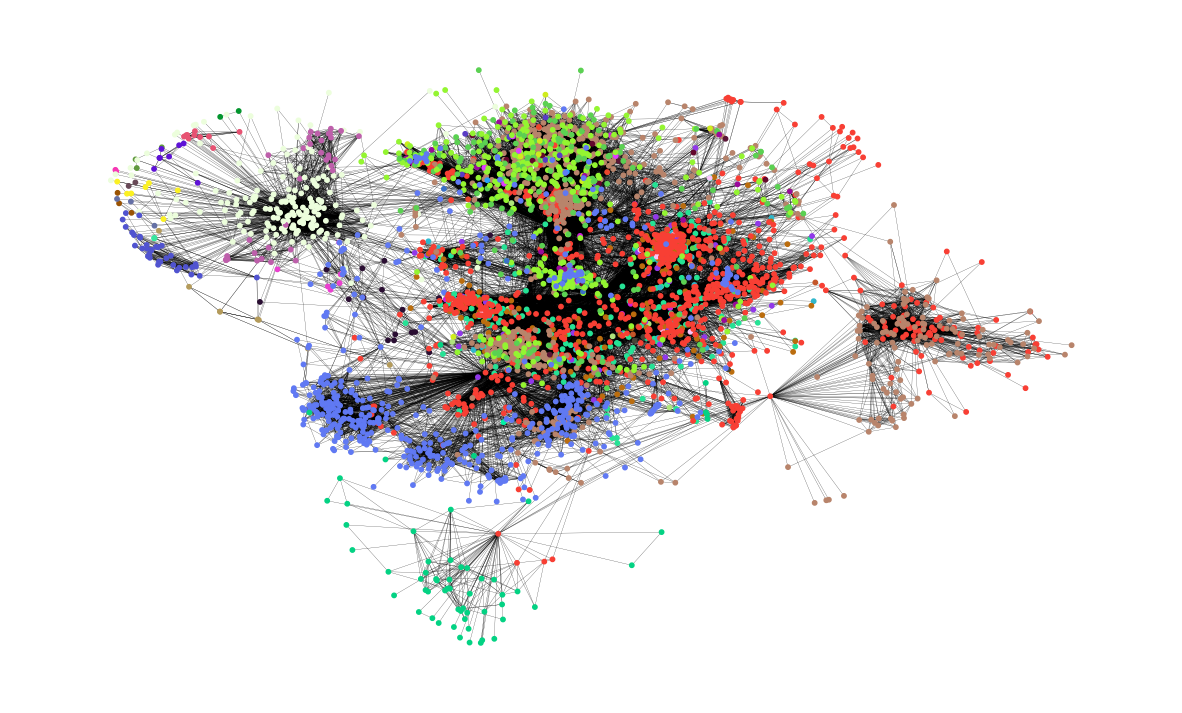
具体来说,检测到了 \(44\) 个社区。现在在图中展示这些社区。每个社区用不同的颜色表示,其节点通常相互靠近。
plt.figure(figsize=(15, 9))
plt.axis("off")
nx.draw_networkx(
    G, pos=pos, node_size=10, with_labels=False, width=0.15, node_color=colors
)
接下来,使用异步流体社区算法[2]。
使用此函数,我们可以决定要检测的社区数量。假设我们想要检测 \(8\) 个社区。同样,将遍历社区,并创建一个颜色列表,为属于同一社区的节点包含相同的颜色。
colors = ["" for x in range(G.number_of_nodes())]
for com in nx.community.asyn_fluidc(G, 8, seed=0):
    color = "#%06X" % randint(0, 0xFFFFFF)  # creates random RGB color
    for node in list(com):
        colors[node] = color
现在在图中展示了 \(8\) 个社区。同样,每个社区用不同的颜色表示。
plt.figure(figsize=(15, 9))
plt.axis("off")
nx.draw_networkx(
    G, pos=pos, node_size=10, with_labels=False, width=0.15, node_color=colors
)
